Redefine drag and drop
Packed with all the features you need for amazing websites, all you have to do is drag & drop.
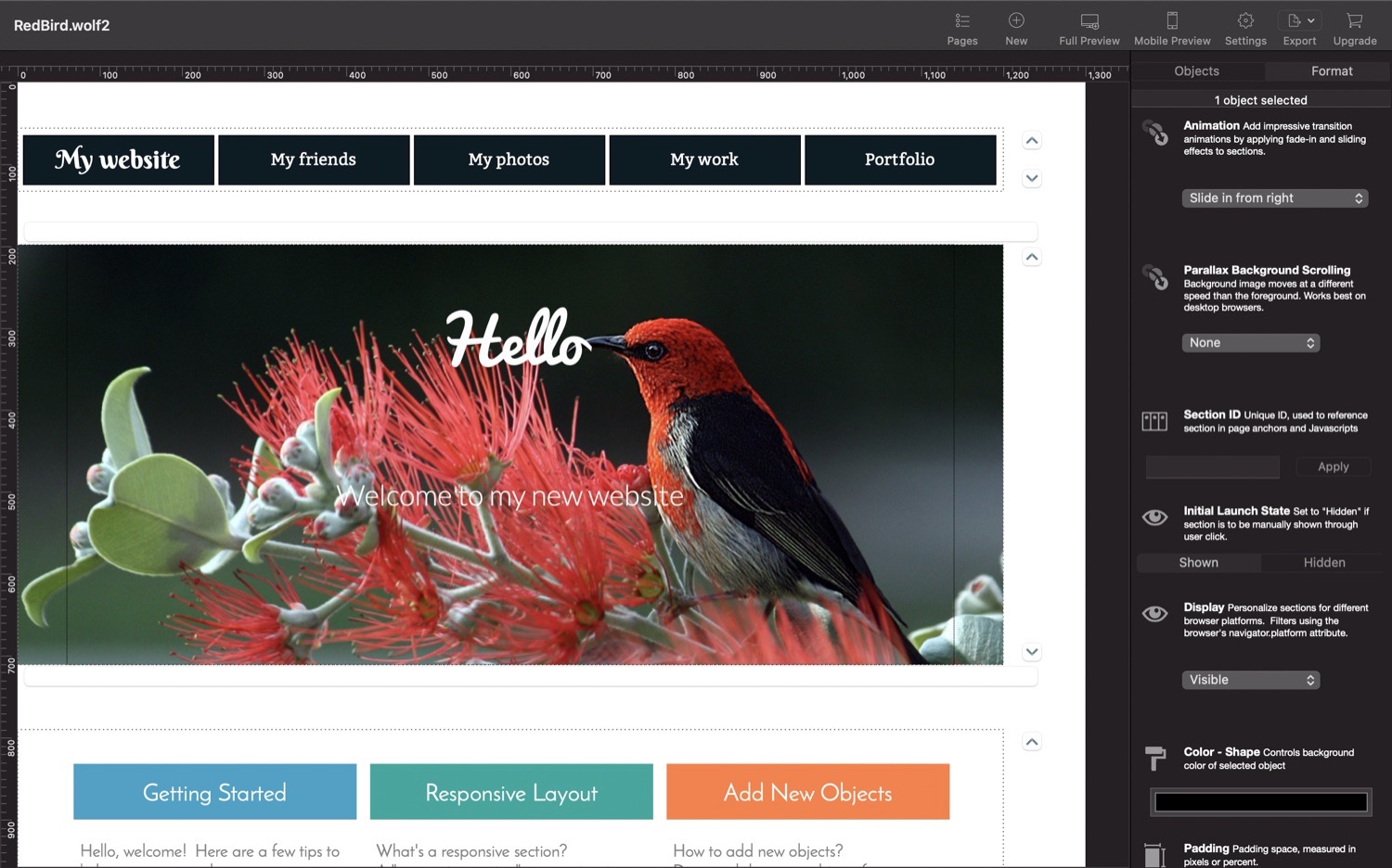
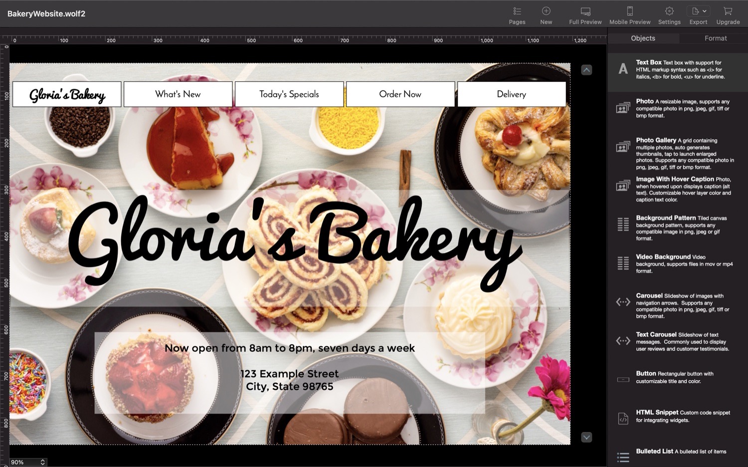
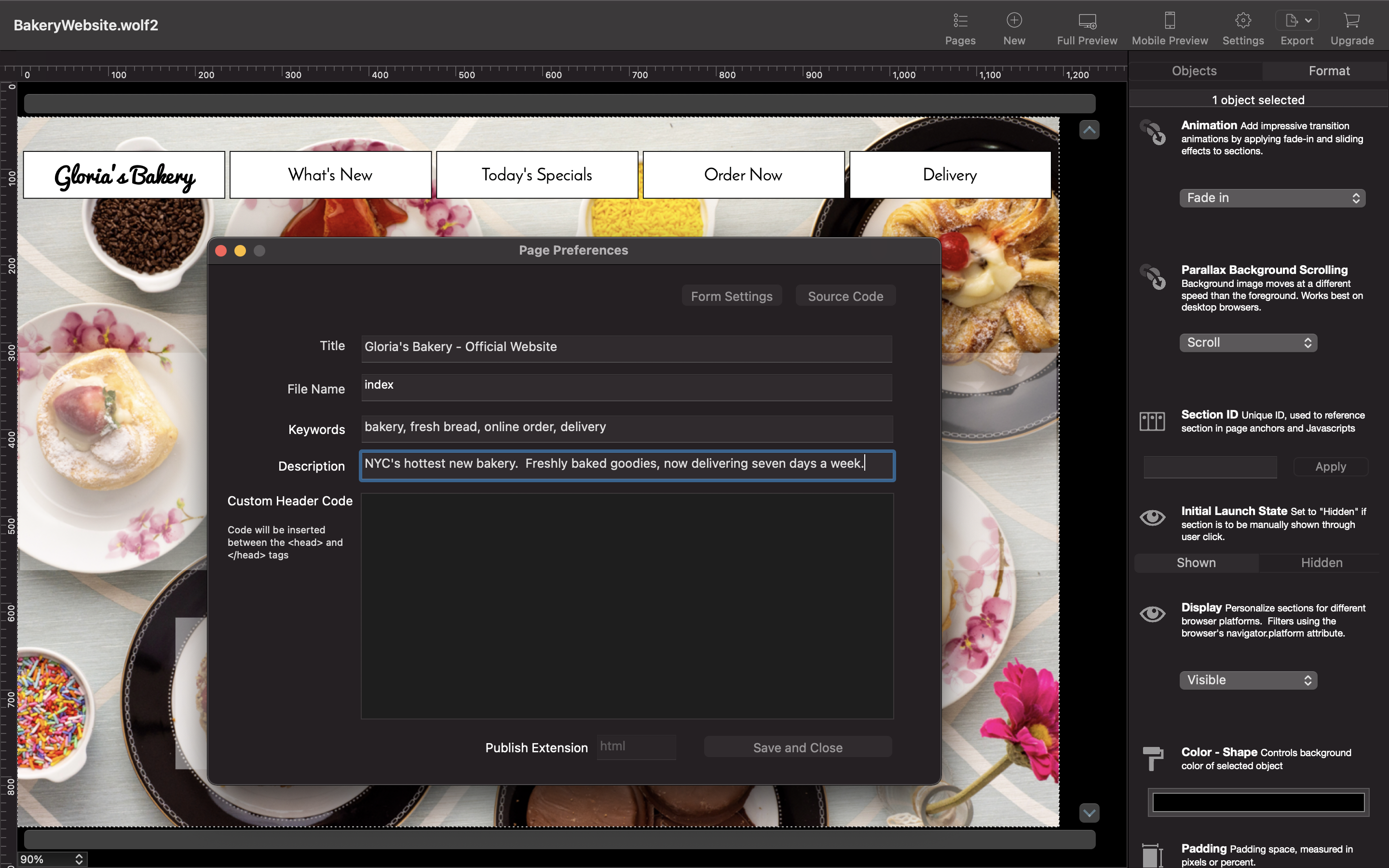
Featuring modern design elements such as lightbox image galleries, carousels, responsive sections, video backgrounds, edge-to-edge section backgrounds, parallax scrolling effects, image animations and collapsible panels.
Beautiful and responsive
Integrated with the powerful Bootstrap Framework, Wolf generates website layouts that work beautifully on desktops, tablets and mobile devices.
Desktop and mobile preview modes make it super easy to quickly compare layouts on different sized screens.
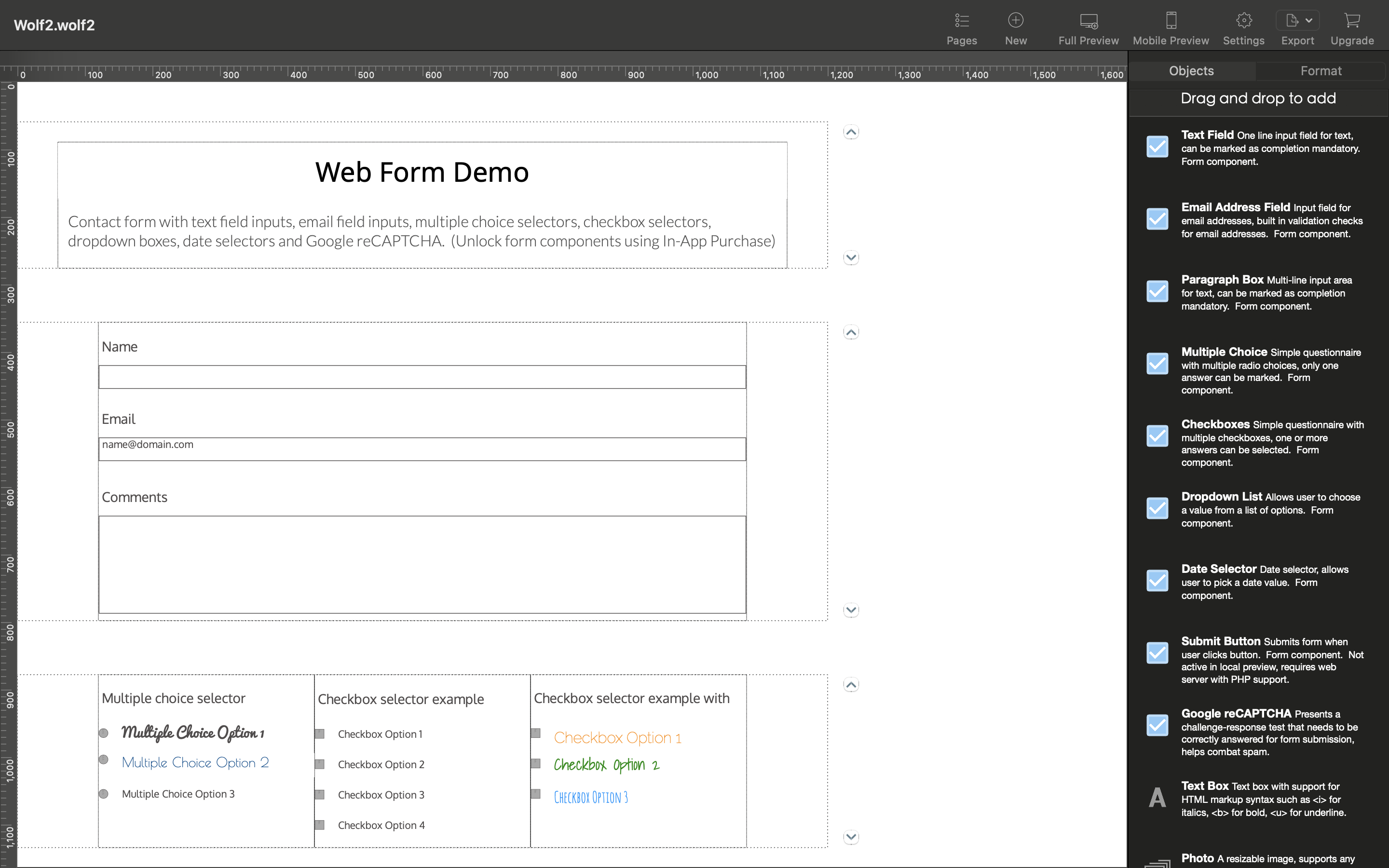
Build websites and web forms
Build mobile-friendly websites and interactive web forms.
Web form features allows you to create professional contact forms with textfields, multiple choice selectors, checkboxes, dropdown lists, date pickers and reCAPTCHA challenge-response tests.